First Concept
Redesign
Redesign 2
Redesign Three

Analysis
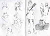
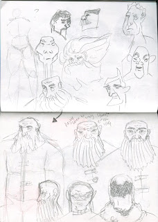
I went through many stages of development. My first set of designs were not best suited for the horror genre as the feedback I got was that they were too friendly looking and had an inconstant style. I felt that I need to introduce a sense of strength to the protagonist for the character to suit the setting of the story. I experimented with body shaped and beard lengths but due to the limitations on time I didn't want to over complicate the design. Next, I looked heavily at references of inuits to make new alterations to the design. Finally, I cleaned up the watercolour turnaround in Photoshop and added digital texture.
I want to blend different textures in my piece to give the appeal of traditional drawing.
I think that I improved on my designs with each iteration. The use of a personalised digital brush will give allow for a soft textile look to come across despite using digital methods to draw. I think that the backgrounds will need to develop over the next few weeks as they look rigid. I prefer the mix of painterly brush strokes and hard digital shapes in the concept art to the background example. It looks more visually interesting and cinematic. The heavily textured second background feels childish and is not suited to horror.
limits-
pencil traditonal- difficult to do backgrounds and time consuming but allows for authentic feel and more control
watercolour- no control of pattern and not easy to remedy mistakes but looks very soft and has strong texture.
digital texture- looks articfical but more control and easy to apply backgrounds and animate quickly


No comments:
Post a Comment