Wednesday, 29 January 2020

6 Networking Opportunities

  • HIVE Animation Social
    Manchester -- 21/02/2020 -- 7:00 pm (SHACK 69 High Street)
    https://www.instagram.com/hiveanimationsocial/
    As a casual meet up, I could get to form friendly relationships with animators near me from all levels of the industry and find out about projects going on
  • Cartoon Business 2020
    Gran Canaria, Spain -- 24/03/2020 - 26/03/2020
    http://www.cartoon-media.eu/cartoon-masters/cartoon-business.htm
    Learn up to date revenue streams for animated series internationally
    Meet international animators
  • Film and Animation Creators Group
    Leeds -- 18/02/2020 -- 7:00 pm (East Parade Social)
    https://www.meetup.com/en-AU/Leeds-film-animation-creators-group/events
    They are a group focused on sharing equipment and collaborating on ideas
    I could get access to technology, get assistance on my projects and get experience in lots of different fields quickly.
  • Edinburgh Short Film Festival 2020
    Edinburgh -- 22/10/20 -- All Day (FlimHouse)
    https://www.edinburghshortfilmfestival.com/archive/
    International attendees
    Meet many smaller studios that may be looking for new team members for the next projects
  • AniMates Network
    Manchester -- 10/02/2020 -- 7:00 pm (Waterside Art Centre)
    https://watersidearts.org/whats-on/2786-animates-animation-network/
    Featured talk is by Curtis Jobling (character designer for Mars Attacks) who is high up in the industry and could potentially jump start a career by a recommendation.
    This event is also open to writers which could be another avenue of tapping into upcoming projects. 

Thursday, 9 January 2020

500 Word Evaluation


Over the course of this project, my time management skills were tested due to multiple unexpected difficulties within my group. Members unfortunately were frequently unable to be present for meetings or complete tasks due to things out of their control. I made myself useful by taking on extra parts of scenes to help such as painting the boulder for the cave, painting a cave background, animating fire and helping colour scenes. By being made producer, I  was more aware of the deadlines and made sure to support the others. In the end, this has allowed for the final piece to be a higher standard than it would have been because elements were more polished and deadlines were ultimately met.

I feel that I have improved as an animator because I have been able to identify issues in my own work and apply solutions. For instance, in my dinosaur walk cycle, I identified that the weight and pace of the character was off for the personality I was trying to evoke. By finding references to help inform my sketches, I knew to stop the knees from rising up too high and to hold the frames for longer. I also think that my ability to apply the 12 principles of animation has improved as I have made active decisions about utilising follow through (the flower being crushed by the meteor) and arcs (the dip of the dinosaurs head). Creating backgrounds and animated with fully painted frames was a new experiment for me. I tried to push myself to be more consistent and I think that has also paid off.

On the other hand, my character designs were my weakest part of the project. I feel like they lack not only appeal but did not completely fit in to the world that the two main characters were designed for. While I made improvements by changing the eyes and focusing more on the initial shape of the characters, they were not completely successful and I decided not to use them in the finished short. Improvements could be made by starting off with  a main character and building on top of that design first. By making completely new designs, I did not allow for the key design elements to become apparent. If I had done this, I could have used similar shaped hands or hip shapes to create continuity. I want to improve in this area. By the end of this project, I have developed confidence in my lining and colouring of scenes which also leads me to feel more optimistic about character design in the future. I think that I would do better after drawing these characters many times and now being familiar with what other designs would suit the established characters.

It was difficult at times to work in a group but I feel that I made useful contributions consistently and helped my group stay in contact with each other by passing on messages and taking notes. While editing was none of our strong suits, I applied what I remembered of premier pro to help organise our scenes all together and used effects to alleviate the production.

Overall, I am very happy with this project. I think that I developed strong backgrounds designs and improves in my practical skills.

Concept and Development


  • After I researched foliage I sketched out some concepts

Articals


Process

The process behind The End is Nigh (2020) was fairly straightforward. As a 2d animation, it is a “flatter world” which means that, unlike 3d animation, we did not need to add more dimension to the background and characters. The complexity of 3D animation requires more time than 2d which is not "as complex... so fewer resources are required". Each frame is no more complex as a process while in 3d or stopmotion the physical dimensions require more forethought and experimentation. Using digital software rather than traditional paper had a huge advantage in the editing process as it allowed for us to use transparent backgrounds. By animating elements separately, we easily layered them over each other while editing which saves times and allows for changes. Scott Lehane celebrates this feature of digital 2d animation in an article about the film Klaus (2019) for Animation Magazine when he praises the film for excelling “past the limitations of a classical animation style” while still maintaining all the advantages.


1)Powerhouse Animation Studio Inc.. (2014) "The Benefits of 2d Animation over 3d". Slideshare. Available at: https://www.slideshare.net/powerhouseanima/the-benefits-of-2d-animation-over-3d-33315000
 (Accessed on 9 January 2020)­

“Such matters are not important in the flatter world of 2D animation”

2) Lehane, S. (2019) "How ‘Klaus’ Uniquely Combines CG Lighting Techniques with Traditional 2D Animation". Animation World Network. Available at: https://www.awn.com/animationworld/how-klaus-uniquely-combines-cg-lighting-techniques-traditional-2d-animation (Accessed on 6 January 2020)


[In Klaus]

"Pablos, determined to produce in 2D, nevertheless was also determined to update the look of traditional animation using more modern visual design technology....The search was on to find ways to move past the limitations of a classical animation style"

Fixed fire


  • The problem was how to transition from the fire of a meteor flying to the fire of the flower igniting. 
  • I solved it by getting rid of the inbetweens and instead overlapping and scalling up or down the transitional frames.
  • It gives the feeling of the igniting fire coming up off the flower which is effective
  • I think shading the fire would have made it more complex and translated more strongly as fire
  • Keeping the fire block colours fits in with the lava being block red, smoke block grey and the water block blue (the elements are all blocked while the environment is painted)

More Scenes

I Lined And Painted but did not sketch: 


I Sketched

I like the slow dip of this action.

I simplified the animation for Doom in this scene as to reuse the same colouring frames and save time for the other members of my group. It is the last scene left before we can completely finish editing. 

I found animating doom the hardest as I had the least character animation and was not used to the character. I tried to make his movements exaggerated but not too distracting as this scene is a slow pan out and the rest of the background has to be taken in by the viewer. 
I think he comes across as frustrated and yappy but, if i could do this again, I would be more experimental with pushing the cartoon physics of this world.  

Cave crack / Dino Walk - Sketched, Lined, Coloured

  • The Dinosaurs walk is clunky and badly paced
  • It has no sense of heaviness and doesn't convey calmness (to show it's peaceful now the volcano has suddenly stopped). 
  • The knees pick up too quickly and high - makes him look like hes scampering
  • I drew it without looking at reference which i think is the main issue


  • I watched videos of elephants and hippos walking
  • Held frames for longer
  • Big Improvement

Wednesday, 8 January 2020

Crush Flower - Sketched, Lined, Coloured

  • 1st attempt - timed wrong. I thought that the heat from the meteor would push the flower down before impact but I forgot the force of projection would push the flames and heat away from the direction it is flying.
  • 2nd attempt - Has good follow through
  • Painting the whole scene is more time consuming than we anticipated but i think it pays off. 

  • Fire animation was very challenging
  • I looked at lots of reference videos
  • The transition from meteor spikey fire to flowy ignited fire is very difficult to blend - I will think of a way to solve this.
  • Possibly a flash and then the fire 


Volcano Rocks - Sketched, Lined, Coloured


  • I added texture to the background to set it apart from the lava
  • I think the pace of this scene works well 
  • I think painting the boulders might have improved the level of finish but we decided as a group against it as the rock in a previous scene isn't painted either


Shot list update


We swapped up some of the scenes over christmas break. 


Shot list


We split up the shots into roles. We hope by changing up who sketches, lines and colours the scene we can create some continuity overall and help each other stay on model sheet. 

We might have to switch up who does what depending on how we go as we have had some group difficulties for individual personal reasons and so want to prepare to support each others work load at times. 

Background Characters Two

Character Redesign

  • Big improvement
  • Better shapes and simpler design
  • Eye match the main characters closer - feels like they are from the same world
I'm not used to such a strong cartoon style but I think this works as a medium between the two main characters, bridging the difference in style.

Background Characters One


  • Designed some background characters to possibly use
  • Idea of designs solid - read as dinosaurs and have elements that match the main characters
  • Execution lacking - they are a complete different style to the main characters overall, colours off, eyes different shape
  • redesign - focus on shape and angles, change eyes and colour, simplify design. 

Backgrounds Three

  • Decision to have two colour palettes
  • Blue = peace
  • Yellow = Danger / volcano


  • The cave was originally going to be made in Maya by Laura K but due to technical difficulties I have lined her sketch and painted it as a back up
  • I feel like the entrance could be improved as it looks odd


  • Scene for running
  • Dragged brushstrokes to suit speed of pan 


  • Revised composition 
  • Added cave left
  • I like these backgrounds 
  • Balanced between detailed and catoony
  • Bright and child friendly

Backgrounds Two


I overlaid the black and white painting from last week with four different colour palettes that matched our mood boards. 


  • Group picked top two
  • Group discussion to merge the top two for a meidium
  • Mocked up concept art


After feedback from the group, using colours the same vibrancy and saturation as the characters was suggested. 


I mocked these up to help demonstrate why that was a bad idea. It is too overwhelming for the eye.

Backgrounds One

During our pre-production, I am going to be designing the backgrounds for our animation.

We met up and created mood-boards to try and hone in on the art direction of our animation.  We all were inspired by the semi-painterly and textured backgrounds of Gravity Falls and Samurai Jack.
 

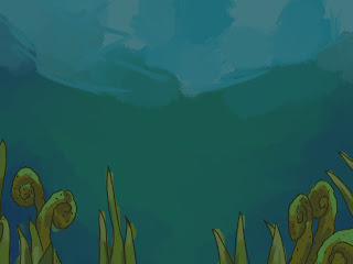
The first sketch i painted was for the underwater scene we later scrapped. I think that losing this shot is a shame as it's more dynamic than a straight on shot but it's not vital for the story and puts an odd pause when the action is supposed to be reaching peak. 

  • I want to keep the textures of brush strokes but line it to match the characters
  • the same world
  • bright colours


  • researched into exotic foliage to suit prehistoric setting
  • odd shapes but uniform 


Tonal painting testing composition and texture. 

Roles

This week we divided up roles within our group. Jenny was unable to be present but as both Demi and Laura K wanted to be directors, we decided that Jenny and I would split the role of producer. During the meeting, I made notes of deadlines that we agreed on and then, with Jenny, made a gant chart to show each task with the dates it should be started and finished by.

We hope to have all the editing done by the 6th of January to allow room to review the work before the deadline.

If we stay on target, we should be able to comfortably finish.


Project - The end is nigh

Last week we all came up with stories inspired by rolling three dice with symbols on each side.The class voted for the most favoured ideas and then we were put into groups.

We identified the market we wanted to focus on (family-friendly, children). Due to this, we decided to not use spoken audio to make it appeal to a world-wide audience.

From here we wrote down an initial script but it was very underdeveloped and had trivial sub-plots. The original idea seemed to go on too long for the time frame of production we have in mind to complete. It also lacked a conclusive ending.

This week we finalised the script and streamlined the story.

Study task 2 - Talk this way


In this task, we were allowed to chose between some different audios to create a lip-sync animation to. Once picked, we had to create a dope sheet to help sort out the mouth shapes in correct order. I identified all the different sounds in the audio and wrote them down. Next,  I sketched out the mouth shapes for all the sounds i could think of and used these to help simplify breaking down the audio. 

The audio had a great sense of tone so I wanted to exaggerate the shapes to express frustration. 

I found using the dope sheet difficult on it's own so I also used post it notes and drew the shapes as i went. I slowed down the audio and followed the shapes with my own mouth to try and find the right pace for each sound. 


I used only key frames without inbetweens to better establish the change in shape. I think that the animation has a great sense of tone and that the mouth shapes fit visually with the sound. 

If i did this again, i would create more movement in the face. The cheeks do not move and the face remains the same thickness. This is unnatural and I think more movement would make the mouth shapes more convincing of the sound.  I also think that the frames could be shifted a little ahead as some sounds almost come at the same time of the mouth shape which almost becomes too late to be read correctly.